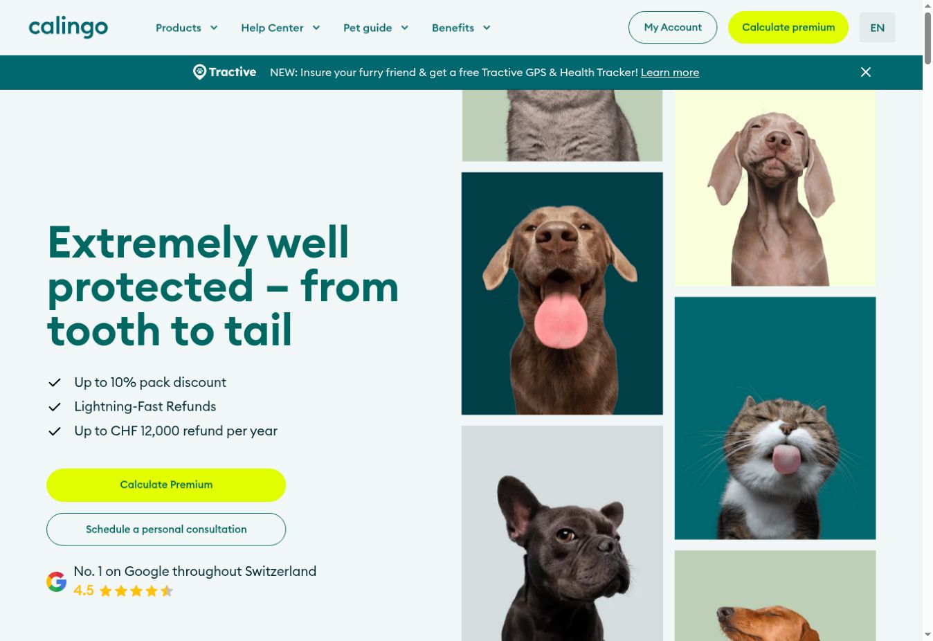
Calingo
Webflow development
A reusable browser frame on the project’s warm gradient.
A practical reference for the colours, type and components behind this portfolio.
Use the site variables for core colours. Project gradients belong to the artwork wrapper.
Barlow leads the portfolio. These specimens use the same classes as the homepage, including their responsive styles.
A clear, considered digital experience, built for people.
Good systems make websites easier to manage and give businesses room to grow.
Main sections: 6vw side padding.
Work: 90% width, maximum 1280px.
Desktop: 2 columns, 28px / 48px gaps.
Tablet: 20px / 36px.
Mobile: 1 column, 34px gap.
Tablet: 991px and below.
Mobile layout: 767px and below.
Check the smallest mobile breakpoint too.
Use this 8px spacing rhythm for new elements. Preserve existing component spacing when reusing a class.
Use the browser frame for standard cards. Keep artwork, title, role and description consistent; add a project gradient as a modifier.
A reusable browser frame on the project’s warm gradient.
wnd-project → wnd-project-art → wnd-browser-art → wnd-browser-window. Use the relevant wnd-art-* and browser colour modifiers.
Keep wnd-project-featured and the featured laptop and phone modifiers. The phone overlaps the desktop at the bottom right.
Replace the image asset rather than rebuilding the frame. Add descriptive alt text and check the crop at every breakpoint.
Use descriptive lowercase names: hero-content, service-item, form-input and footer-contact-link. Reuse the base class before adding a modifier.
wnd-* identifies the portfolio system. Project names modify artwork colours; featured modifiers adjust the Bloxspring layout.
sg-* styles belong only to this reference page. Edit shared specimens through their original classes to keep the homepage and guide in sync.
Check where it is used, its combo classes, responsive overrides and interaction targets. Preserve animation hooks such as outline-button, button-hover-outline, social-icon, social-hover-wrapper, menu-list-item and footer-list-item.